The mark stands alone. Never pair it with the wordmark. Use the mark in place of the wordmark wherever you can. The mark always comes first, unless one of the cases below applies. For example, a letterhead can carry the mark, with “Motive Unknown” in its text or its address.
Wordmark
Use the wordmark only when people must read the name and the mark alone is not enough. That is the case when you cannot control the context, or when you expect that people will not know the mark. Our main aim is to make the mark known, so use the wordmark only a little. You can also use the wordmark where the mark does not fit well, for example on a logo wall. You can also use it where a message needs a short written name for the company.
Both marks are fixed artwork. On screen, set them through the LogoMark and Wordmark components. Everywhere else, use the files from this page. Never set “Motive Unknown” in a typeface in place of the wordmark. Write “Motive Unknown” as text only where the mark or the wordmark is already present. Even then, write it only when the text describes the company, for example “Motive Unknown is a …”.
Profile pictures
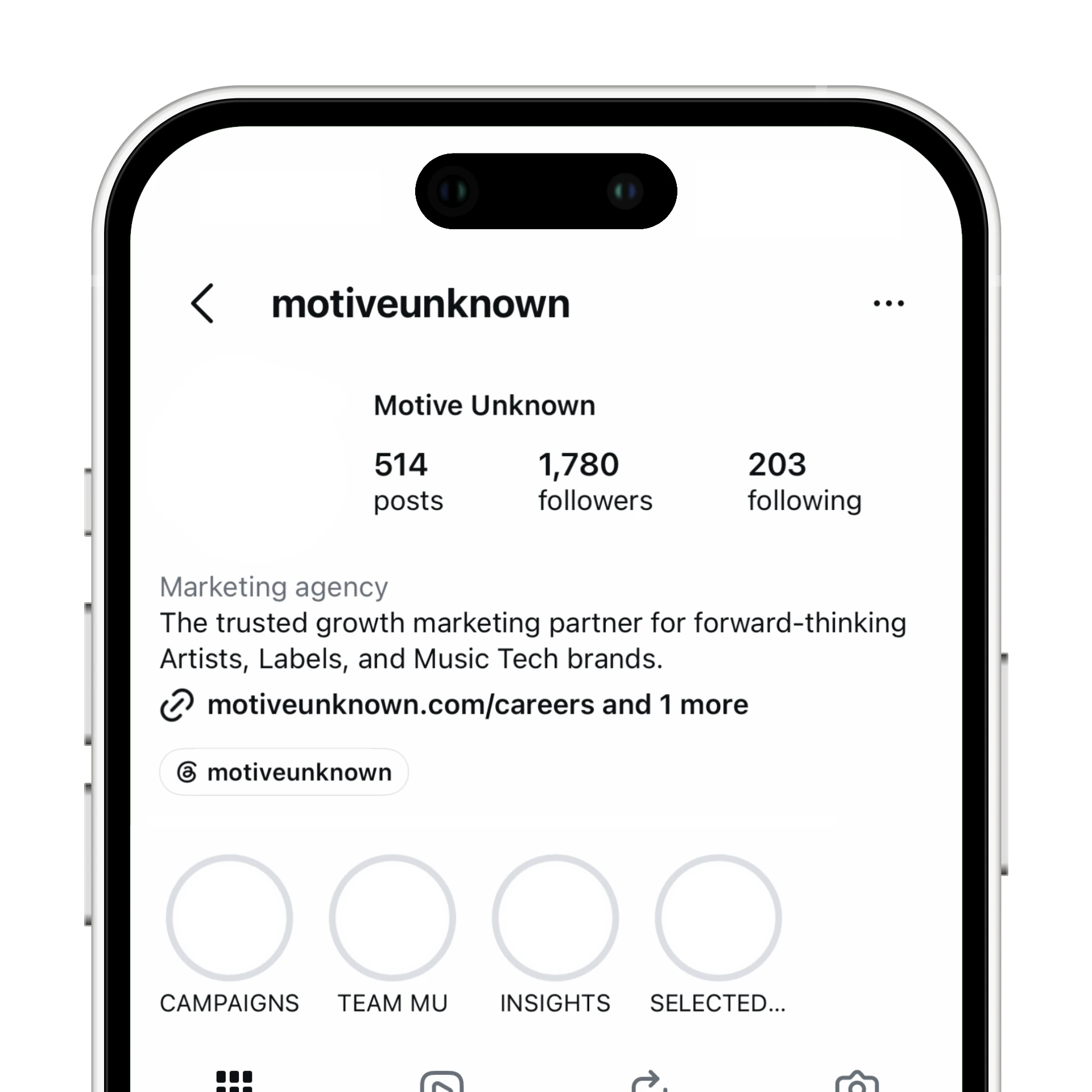
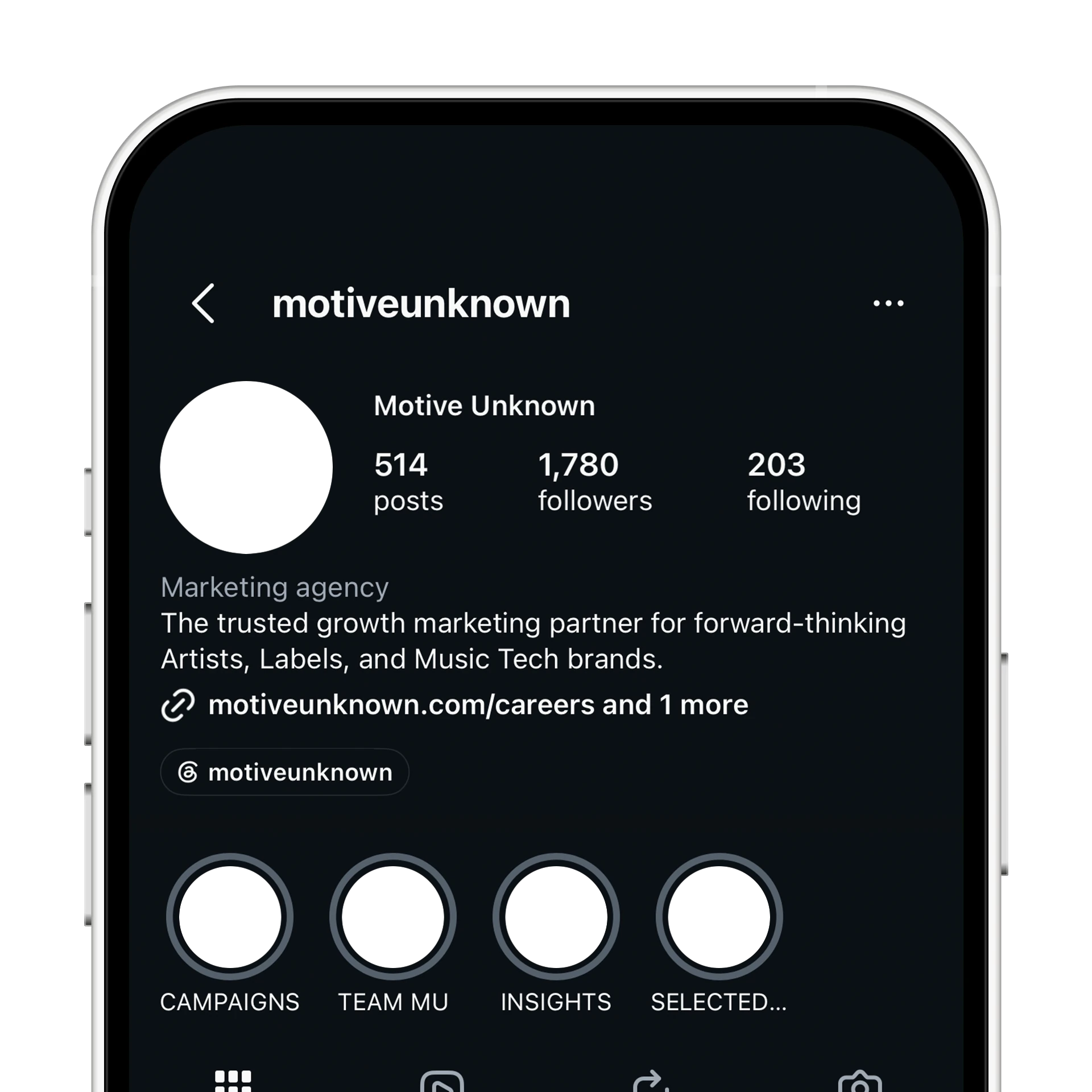
Use these two versions only as a profile picture on a social platform. Each one puts the mark inside a shape. Use the circle where the platform crops the picture to a circle. Use the square in all other places. Do not use them as a logo on a page or in a layout.
Clearspace
Keep clear space between the mark or wordmark and every other element. On every side, this space is at least half the cap height (Y). More space is always safe.
Do not use the mark smaller than 16px tall on screen. Do not use it smaller than 6mm tall in print.
Colour options
The mark and wordmark are always one solid colour. Pick that colour from the palette and layout on the Colour page. Never use two colours on one mark. Never use a gradient, except in an interactive mark, like the one at the top of this page. A static mark is always solid.
Usage
Do
Don't
Do
Don't
Do
Don't